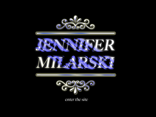
Whilst designing my portfolio website I came across a tutorial in Computer Arts magazine which ‘shows you how to turn flat typography into rich and vibrant lettering’.
As I am a relative new comer to Photoshop, this tutorial which had a suggested completion time of 1-2 hours actually ended up taking me a few days as I became enraged and had to keep walking away from it…….. Also it did have a tendency to look like clip art!
Here is the finished result of my attempt:
I was relatively pleased with this finished version, however when I had completed it, I realised the absurdity of having my name as the front page for my site when nobody knows who I am! The Keith Tyson site works because he is a well known artist (and obviously because it is very well done!) but although I will now not be using this for my site, it was a good experience getting to grips with aspects of Photoshop that I was previously unfamiliar with. I also can’t deny that it was fun to sort of see my name in lights!
You can find the online tutorial here:
http://www.computerarts.co.uk/tutorials/make-your-type-pop-layer-styles


